
Infographics as Assessments for Nonfiction Reading
Introducing infographics as a means for sharing student reading choices among my fifth-graders last year, I saw immediately how the visual tool supercharged student engagement. After creating their independent reading book shares (essentially digital posters), my students had gained some practice with distilling a book’s meaning into a tweet-sized comment and with visual representation of an idea. But something just wasn’t clicking. They ended up with some nice digital posters, but little else.
Just for fun, a few students who finished early began polling their classmates and making infographics from the results. Cupcakes vs. cookies, Hunger Games vs. Harry Potter, winter vs. summer. These students had made a leap of understanding I hadn’t asked for: the images on an infographic were meant to convey data and information with the powerful impact of visual design.
This year I revisited the infographic as a means for assessing nonfiction reading and research. Although some students are still finishing their projects, this year’s results far surpass last year’s because I changed my approach to marry the infographic to nonfiction reading (factual information) and data gathering through authentic research.
Step 1: “Book Club” Reading of Nonfiction
Looking for a way to use “book clubs,” a pedagogical tool of the Reading and Writing Institutes of Teacher’s College at Columbia University, I called upon my student Design Teams (the newest incarnation of my Student Learning Teams, previously discussed at Getting Smart), who had already begun collaborative group work, to choose a contemporary or historical innovator to study and learn from. They would read biographies, autobiographies, or nonfiction articles to gain a better sense of what allowed these creative folks to turn their worlds upside-down.
Step 2: Introducing Nonfiction Reading Skills
I began our study of nonfiction with On a Beam of Light by Jennifer Berne, a beautiful picture book illustrated by Vladimir Radunsky based on the life and inspirations of Albert Einstein.
Next we reviewed several internet articles about the innovations of disaster relief pioneer Clara Barton. This allowed us to discuss ways to approach nonfiction reading: how to pinpoint key facts, how to discern the impact of perspective, how to filter for a particular purpose, how to make use of visual information. We also reviewed good practices for reading and evaluating websites.
Step 3: Online Discussion Boards
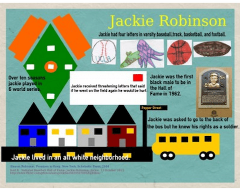
The Design Team book clubs then began debating which innovator they would choose for their nonfiction focus. Lively discussions continued online via our school’s web portal. Students began spontaneously to gather information to support their favorite choices. Later they would use the same discussion forums to share their online discoveries and to discuss possible designs for their infographics. Ultimately, they chose Steve Jobs, Leonardo Da Vinci, the Wright Brothers, Martin Luther King, Jr., Jackie Robinson, and Edward Jenner as subjects for studying the innovative process.
Step 4: Data Collection, Data Sharing
Students began their reading with a clear purpose in mind: to find information that could help them define the skills, circumstances, or frame of mind that might contribute to innovation. They mined their reading for data and took notes on sticky notes, digital or otherwise. Using their notes for reference, they met face-to-face to share their ideas and distill the secrets of their subjects’ innovative lives. Sharing continued naturally online as they reviewed their research for translating into an infographic.
Step 5: Designing the Infographic
I had introduced the concept of the infographic earlier in the process, so my students had an idea do what they were looking for. We had a good time deciphering a holiday infographic,“Christmas by the Numbers,” followed by a preview of how to create a good-looking Christmas tree with triangles, circles, and a rectangle on easel.ly. Some students jumped righted in and started playing around with designing their own graphics over the holiday break.
Even though my students were chomping at the bit to get started designing online, I held them back. They would first design on chart paper with markers, rulers, and glue. The strategy worked to keep students focused on the design rather than the cool features of the online tool. For each team, some students shrank the information they had gathered into brief statements of fact. Others worked out the visual language to represent those facts. Still others gathered resource information for sharing. Finally, team members used the chart paper to work out the structure and design of the infographic itself. Again, they continued to collaborate, unprompted, via the online discussion board.
Step 6: Building the Infographic
Once their chart paper designs were complete, students were allowed to begin putting the pieces of the infographic together in easel.ly. By now they were begging for permission to work at home on their projects. This contrasted significantly with last year’s students, who floundered when working on their own. I remember one email from a frustrated parent, who wrote, “How can I help my child with his homework when I don’t even know what an infographic is?” In contrast, teams coordinated after-school meetings to learn and teach each other.
Step 7: Finding an Audience
Our next step will be to share our infographics with others. I plan to post their original chart paper designs in our school’s hallway with QR codes attached, so that older students, who use iPads in their classes, will be able to access the infographics and see the translation from chart paper design to digital implementation. And, with my students’ permission, I hope to use some well-timed tweets to share their quality research on innovators with the world.
Afterthoughts
Not only have I reaffirmed the need to match the right tool with the right project, but I have also found what seems to be an effective blending of online and face-to-face work. I’ve learned from this experience that more time spent teaching the skills of reading nonfiction can be well rewarded. I’ve confirmed my hunches that the infographic can offer an attractive incentive for collaborative research and design at the same time that it teaches practical skills in distilling information down to essential facts that can be represented in a visual format. As an assessment, an infographic can give students an authentic experience with sharing data and information for public consumption.
This past weekend, my step-daughter Emily, who works in the field of non-profit fundraising, asked me out of the blue, “Do you you ever teach your students about infographics?” I beamed with pride as I showed off my students’ hard work. Others at our gathering, all older than Emily, wanted to know what we were talking about. Emily said it best: “I use infographics all the time to digest the information people don’t take the time to read in my reports.” Essentially, Infographics provide data in an appealing visual form that capture readers’ interest.
Then, as my students began another research project, one announced, “I just found an infographic!”
Ah, I thought to myself, I’m on the right track.
More Resources on Infographics
Kathy Schrock’s Guide to Everything: Infographics
Ten Facts about NASA: Rate Our Infographic
Kyle Vanhemert, “13 Best Infographics of 2013,” Wired, 17 October 13.


Elizabeth Holloway
Susan Thank You for such a great article! Love the break down of the steps and the considerations esp. finding an audience. I am sharing.